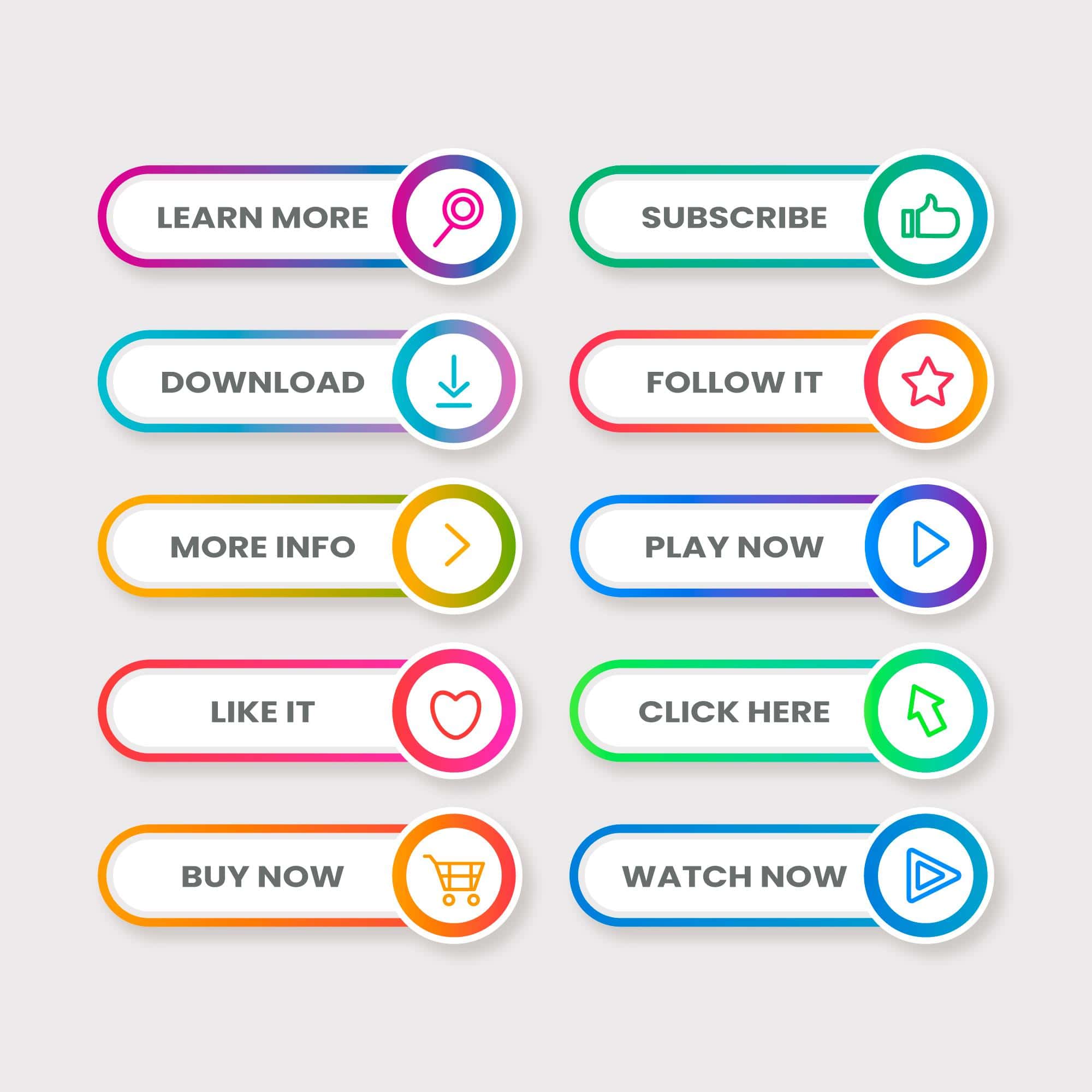
Call to action (CTA) buttons are a crucial element of a website’s design. They encourage visitors to take specific actions, such as making a purchase, signing up for a newsletter, or contacting your business. The type of CTA button you use depends on your website’s goals and the actions you want your visitors to take. Here are some common types of CTA buttons:
“Buy Now” or “Shop Now”: These CTA buttons are commonly used on e-commerce websites to prompt visitors to make a purchase.
“Sign Up” or “Join Now”: These buttons encourage visitors to sign up for a newsletter, create an account, or register for a service.
“Get Started” or “Start a Free Trial”: These CTA buttons are often used by software-as-a-service (SaaS) companies to invite users to begin using their product.
“Learn More” or “Read More”: Use these buttons when you want visitors to explore additional information on your website, such as blog posts or product details.
“Contact Us” or “Get in Touch”: These buttons prompt visitors to reach out to your business for inquiries or support.
“Download Now”: This type of CTA is used for downloadable resources like eBooks, whitepapers, or software.
“Request a Quote”: Ideal for service-based businesses, this CTA encourages visitors to request a price quote for a specific service.
“Watch Video”: If you have an introductory video or product demo, this button invites visitors to watch the video.
“Add to Cart”: This CTA is specifically used on e-commerce product pages to encourage users to add items to their shopping cart.
“Book Now” or “Reserve Your Spot”: Commonly used for booking appointments, hotels, or event reservations.
“Subscribe”: Encourages visitors to subscribe to your newsletter, blog updates, or other content.
“Request Demo”: Often used by B2B companies, this CTA invites potential clients to request a product or service demonstration.
“Get a Quote” or “Estimate My Cost”: Ideal for businesses that offer customized products or services, this CTA encourages visitors to request a price estimate.
“Share” or “Refer a Friend”: These CTAs prompt users to share your content or refer friends to your website.
“Donate Now”: For nonprofit organizations, this button encourages visitors to make a donation.
“Call Now”: On mobile websites, this button allows users to initiate a call to your business directly.
Remember to make your CTA buttons visually appealing, with clear and concise text, a contrasting color, and an easily clickable design. Additionally, their placement on your website can significantly impact their effectiveness. Experiment with different types of CTAs and their placement to determine what works best for your specific goals and audience.
I hope this information helps you to design your wbesite. You can reach out to me for website at dharmesh@shop4website.com or schedule meeting with https://calendly.com/shop4website/30min


Leave a Reply